Our Home's Paint Colors and Which ones we Regret
4:05 PM
For a while, I've wanted to put all our paint colors in one place. You guys know I love a good trend, but I wanted to keep our home's colors cohesive after our old house, which Joe called "the fun house" because of my crazy paint color choices. We had a red office/guest room, a lime green kitchen, and an aqua bathroom. And I was threatening to put orange somewhere (Lord, help me). I went in the opposite direction here with neutral paint colors and punches of boldness (hello master!). I thought it would be fun to share our paint color choices with you along with which colors we love and which we regret. (#oops). I'll also share my #1 paint tip and my thoughts on color matching. Here goes:
The open concept first floor:
The first floor is an open concept- the living room, kitchen, everyday eating area, and entry can all be seen at one time. All of those spaces (except the entry) are painted Benjamin Moore Halo, color matched (more on that later) at Home Depot. At the time, Home Depot had a "scrubbable matte" formula which I don't think exists anymore but we love it. I wrote a bit about it here.
The kitchen cabinets:
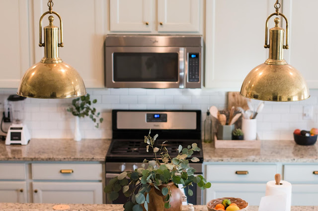
I 95% love this color in the kitchen. The kitchen cabinets are Sherwin Williams Austere Gray which is a very light greenish gray. You can see the inspiration for them here and read more about the decision to paint them here. The color is great most of the time and I love how well they work with the brass hardware and the pendants (I talked about that luck find here). But at certain times of the day, they are a bit more green than I'd like. They also made finding a shade for the rest of the first floor a bit daunting. Colors I thought I loved looked terrible (and very blue) next to the cabinets. But even with its flaws (if you can call them that), I'm a fan.
The entry is Sherwin Williams Mindful Gray. This is one I regret. There's no natural light in the entry and this color just looks...dull. Also, I was almost over gray by the time we bought this house but this is sooo gray. I plan to repaint it after I get over how long it took to repaint this room. (hint: forever). Also, the entry has changed many times since this picture. But it still looks kind of sad. haha. Not pictured is the almost black interior door (which I love). It's now Sherwin Williams Iron Ore.
The guest bath:
This room is Benjamin Moore Hale Navy (color matched at Sherwin Williams). I'm filing it in the "regret" column. It's a dark navy that looked SO GOOD in an inspiration bathroom, but in mine, it's way too purple-y. I don't hate it but just I don't love it. I also don't love how it works with the hall tree when the bathroom door is open.
The hall tree:
The hall tree is Sherwin Williams Roycroft Pewter. I don't regret the actual color but I do regret not taking the risk I really wanted to take. I pinned a lot of dark and moody tones but chickened out and went with this medium, bluish gray. It's ok but not the wow moment it could have been. I don't know that I dislike it enough to change it except for it's the first time I tried to use varnish and I DID A TERRIBLE JOB (yelling at myself, not you). So for that reason, it should be sanded down and re-done. And if I'm gonna do that...
The fireplace:
Yay for another 'I love it' color! It's Sherwin Williams Tricorn Black. And it's amazing. It's just black. No weird green or purple undertones. It really made that tiny black box and lackluster builder basic mantle look more special.
The playroom:
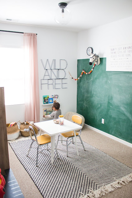
This room is Valspar The Perfect White right off of the shelf at Lowe's. And you know what? They didn't lie. I love it. It is perfect. You might have caught my stories about the hard time I had choosing a white paint color for this room. White paint can have green, blue, yellow, or pink undertones- it's difficult to find the perfect shade. But miracle of miracles, I see zero undertones in this room! The chalk wall is Rustoleum Chalkboard in Green (or here). Again, it's love at first sight!
The stairwell, loft, and upstairs hallway:
For this section of the house, we finally hired someone. PTL. The color is Sherwin Williams Alabaster which is a warm white. I'd describe it as the white paint you use when you want to paint a room white, but you're afraid of it being too stark. Or you're afraid, period. There's still pigment and you can clearly see the difference between the Alabaster "white" and the ceiling and trim, but the room still looks very bright and almost white. No regrets.
I loved the paint color from Dax's nursery so much I repainted it in our new home. It's Benjamin Moore titanium and I'm sure we color matched but I can't remember where (Home Depot or Lowe's most likely). It's the perfect greige.
Sources for his reading nook here.
The girls' room, phase 1:I was still in my 'I love bright colors!' phase but was trying to tone it down with Sherwin Williams Silver Strand. It's a beautiful color but I always felt like it was too much with their headboards. Also, it locked me into a color scheme and so I resented it for that. haha.
sources for mermaid room here
The girls' room now:A local friend told me she was mesmerized by my stories when I publicly agonized about choosing the right white paint color for the girls' room. #yourewelcome. ha. I don't think I nailed it. I'd say I'm in like, but not in love with Behr Marquee Pure White. I know there's a more perfect white out there. This is also an example of when color matching doesn't work. They couldn't match some of my friend's suggestions (she's a designer so I always go to her first!) and of course I wonder if one of them would have been perfect!
The kids' bathroom vanity:
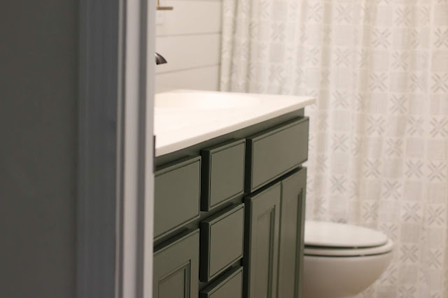
This one is love, sweet love. It's Sherwin Williams Rosemary and it's beautiful. I literally brainstorm where else I can use this color (maybe the hall tree?!) pretty much every time I go in the kids' bathroom. If I ever find a vintage mini with pink and green tones, it'll be the icing on the cake!
The master bedroom:
I had dreams of painting this room blush when that color was trending. But my friend suggested a dark green- this was before I was seeing it everywhere- and what can I say? I was intrigued. I wanted our room to be intimate, romantic, and calm and somehow this deep and moody color delivers. It's Sherwin Williams Cascades. We tested Benjamin Moore Salamander and it looked nearly black in there so I'm glad I found this lighter version. While I love the color, it makes me wish for more light in this room. Also, a lighter headboard would complement it better than our tall charcoal one. That said, whenever I say anything about maybe changing it in the future, Joe interjects and says he really likes it. Usually, he doesn't have a strong opinion on paint so that shifts this choice over in the no regrets column for me. ;)
And one more time, all together:
How do you choose paint colors? Any amazing shades we should know about? Or major regrets we should avoid?
(This post contains affiliate links)


20 comments
I love Cascades. I have wanted a green accent wall in our master for a long time. After seeing your photos I think I am going to go for it.
ReplyDeleteyou should do it!
DeleteDid you ever paint the accent wall? Do you like it. I painted cascades for an accent wall and found it is tricky to match with furniture.
DeleteI just painted an antique chest in Cascades for our new home. Love it so much, I'm going to use it as an accent on a ship lap wall in the den. Beautiful, deep color. If you're looking for the perfect white still, try SW Snowbound. It's a really soft white, with no creamy undertones. To me, it's the perfect white. Not stark at all.
ReplyDeletethat sounds lovely- and thanks so much for the snowbound suggestion!
DeleteI love the cascade color of your master bedroom! I have found with dark colors that the dark walls clash with commercial white ceilings. Its just simply too much of a contrast. Takes yours for example; it is not the color so much but the dark contrast of the commercial white ceiling that is clashing with your walls. I have started painting my ceilings with either a lighter color of the wall color or a coordinating color to make the color seem more cohesive.
ReplyDeleteI'm considering painting my kitchen cabinets two toned, with Rosemary at the bottom and possibly the alabaster white at the top. My home style is very relazed, we live on some acreage so it has a farm house feel without it going too far. Opinion?
ReplyDeleteHow refreshing to hear (read) someone give an honest assessment of their decorating decisions. Thank you for this! I'm terrible at picking colors & strike out so often I've decided to pay for a color consultation for my kitchen! Lol
ReplyDeleteworth it!
DeleteHi! Which sheen did you use for cascades color?
ReplyDeleteIt only came in matte at the time...
DeleteI painted two accent walls in my living room cascades. I wish I would have had a sense of how blue it would look beforehand. My stuff is shabby and the very high saturation almost crayon like color is overwhelming. I want to change it already. Maybe to BM Tarrytown green SW Tarragon or SW Juniper.
ReplyDeleteFor those who did use cascades how did you coordinate with other colors. I am currently trying to go for green accents everywhere. Sadly my couch is a light taupe & tan and it is old. So I can't change that. The Annie sloan firle color which is a vibrant chartreuse color looks GREAT with the cascades but not so much with my couch so I'm trying to figure out a way to keep elements of tea & chartreuse working within a antique theme. Any ideas would help. If I could show a pic I would but I don't see how to do that. Thx.
ReplyDeleteYou have helped tremendously - Planned on Rosemary as exterior siding with alabaster trim - but after seeing your Rosemary, I'm getting a half-cut version of Rosemary to try for the siding with maybe "full strength" for the porch and patio - we'll see today. Whew! Thanks - I know monitors/screens read differently, but it does appear darker than the samples online did. Did I say - Thanks! Everything looks fab, btw
ReplyDeleteI adore rosemary!
DeleteI'm painting my fireplace tricorn black, from floor though ceiling. I know it's hard to decide on white without sampling based on sun light and watts, but which whites should I be considering for the walls around the fireplace, and the ceiling/baseboards? Crisp white to accept the fireplace, or a warmer white? TIA!
ReplyDeletealabaster from Sherwin Williams always works well with tricorn black
DeleteWe are considering Austere Gray for our kitchen cabinets, but I am having a hard time committing because I can't find real life examples of it used on cabinets (aside from your photo). The other color we are considering is SW Comfort Gray, but I'm afraid it may read too blue during the afternoons when there is bright light. I know both of these grays tend to change throughout the day, but for whatever reason I'm more ok with the tendency toward green than blue. In my mind, light blues are notoriously fickle and can read coastal or nursery when you don't intend for them to. Is there any way I may be able to see other pictures of your cabinets to get a better feel for the color in real action?
ReplyDeleteAlso we are doing Cascades for the vanity in our guest bathroom. It was inspired by a Room & Board vanity but we are having it custom made for the space. What a beautiful color. Happy you feel the same!
We are considering Austere Gray for our kitchen cabinets, but I am having a hard time committing because I can't find real life examples of it used on cabinets (aside from your photo). The other color we are considering is SW Comfort Gray, but I'm afraid it may read too blue during the afternoons when there is bright light. I know both of these grays tend to change throughout the day, but for whatever reason I'm more ok with the tendency toward green than blue. In my mind, light blues are notoriously fickle and can read coastal or nursery when you don't intend for them to. Is there any way I may be able to see other pictures of your cabinets to get a better feel for the color in real action?
ReplyDeleteAlso we are doing Cascades for the vanity in our guest bathroom. It was inspired by a Room & Board vanity but we are having it custom made for the space. What a beautiful color. Happy you feel the same!
I love the bedside tables! Where are they from?
ReplyDelete